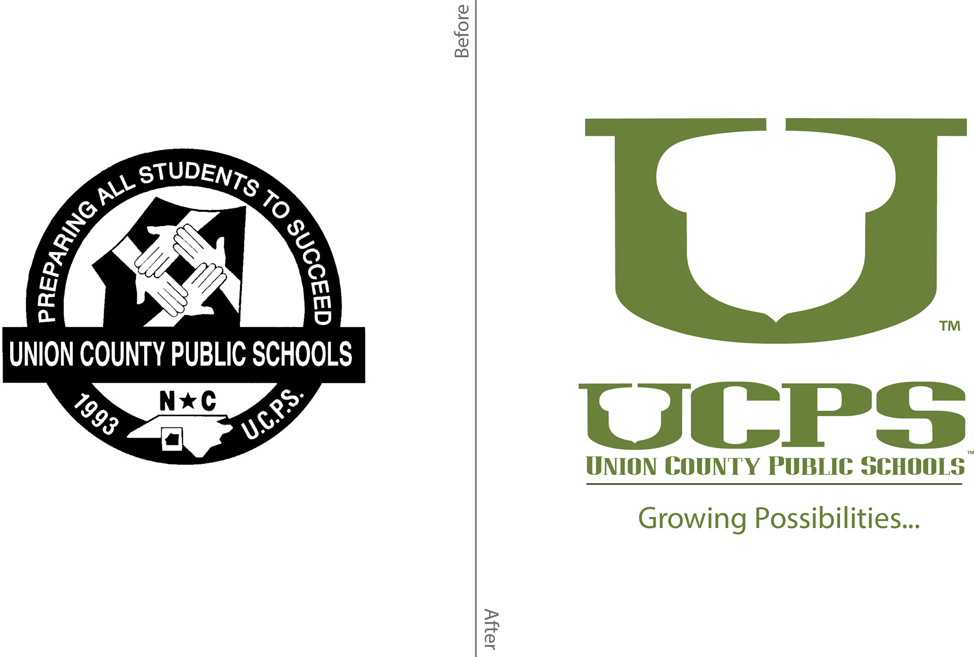
Union County Public Schools (UCPS) had a scattered and fragmented visual appearance. I was tasked with visually unifying a district that no longer looked like a single Institution, and was not trusted within the community which it served.
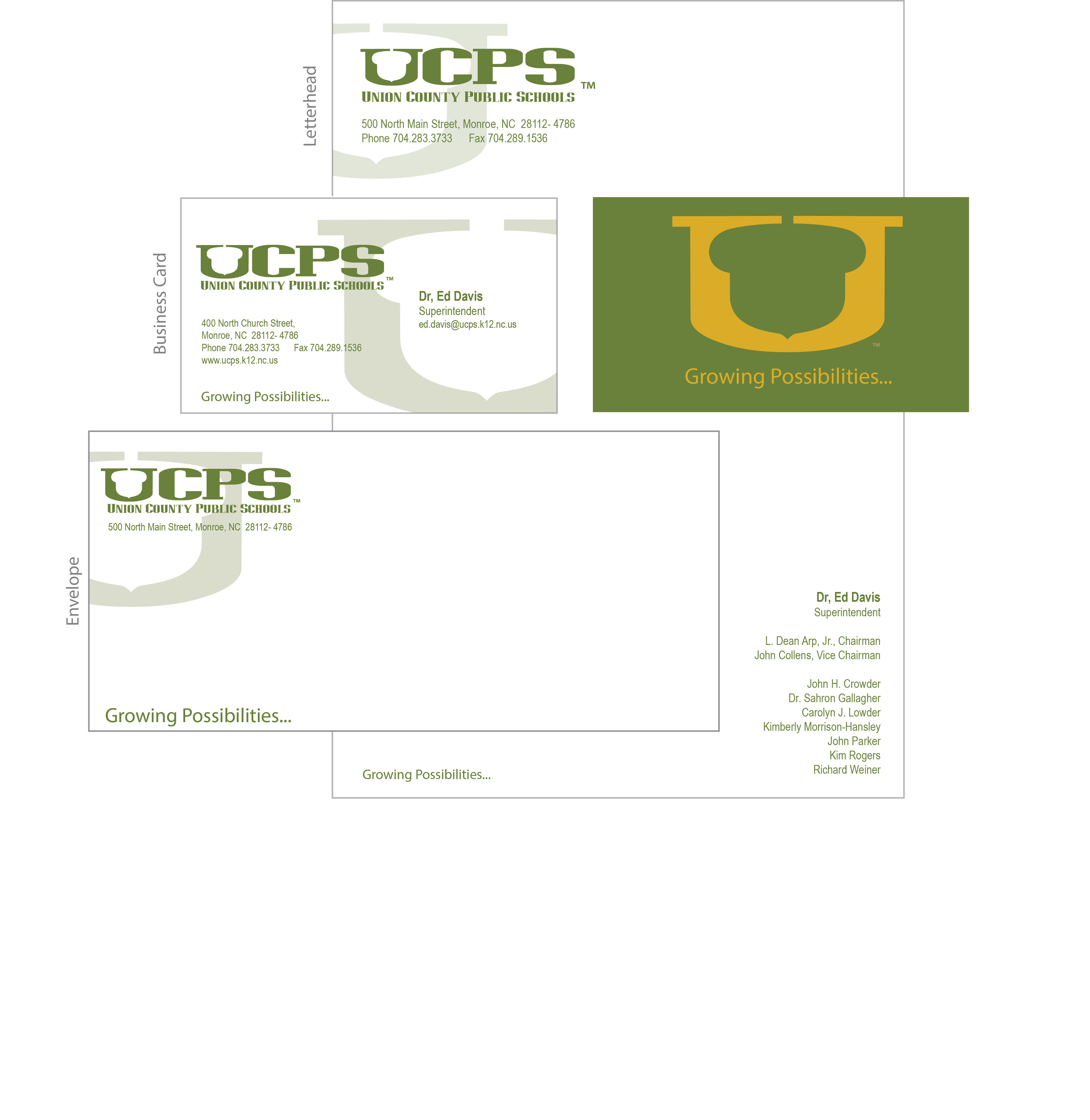
Through my efforts, they are now represented with an innovative logo, a nationally recognized website, professional publications, engaging social medial content, captivating video, attention-grabbing presentations, and award-winning photography, all originating from this new visual brand identity.
This re-branding initiative received an NSPRA (National School Public Relations Association) National Awards of Excellence for Brand Identity Package.
With this new visual image, UCPS is now represented by a clean, modern visual identity that best represents the core of who they are: A school system and not a system of schools.
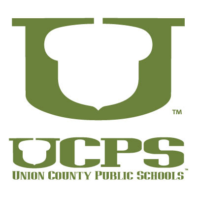
The acorn symbol, within the "U", represents the hidden potential within all students.
It is our responsibility as a district and stakeholders to nurture and help them grow into a mighty oak tree.
It is our responsibility as a district and stakeholders to nurture and help them grow into a mighty oak tree.